

UNICEF Innovation: U-Report · 2015 · Shipped to Production
U-Report polls went out to 282,197 participants at a time, producing thousands of responses across districts, demographics, and open-ended replies. I designed the web system that made those results legible across every country running U-Report.
ROLE
Lead UX/UI Designer
PLATFORM
Responsive Web
TIMELINE
4months
00 · Overview
What is U-Report?
U-Report is UNICEF's SMS-based platform for youth civic participation. The website's job was to show the outside world what the replies added up to. By 2014, six countries were running it, with plans to expand. I worked on the web layer, designing one system that could present the data consistently while giving each country room to configure its own site.
My Contribution
Led UX/UI for the public-facing web: IA, wireframes, visual design, and templating for engineering handoff
Designed the country-configurable template system for expansion
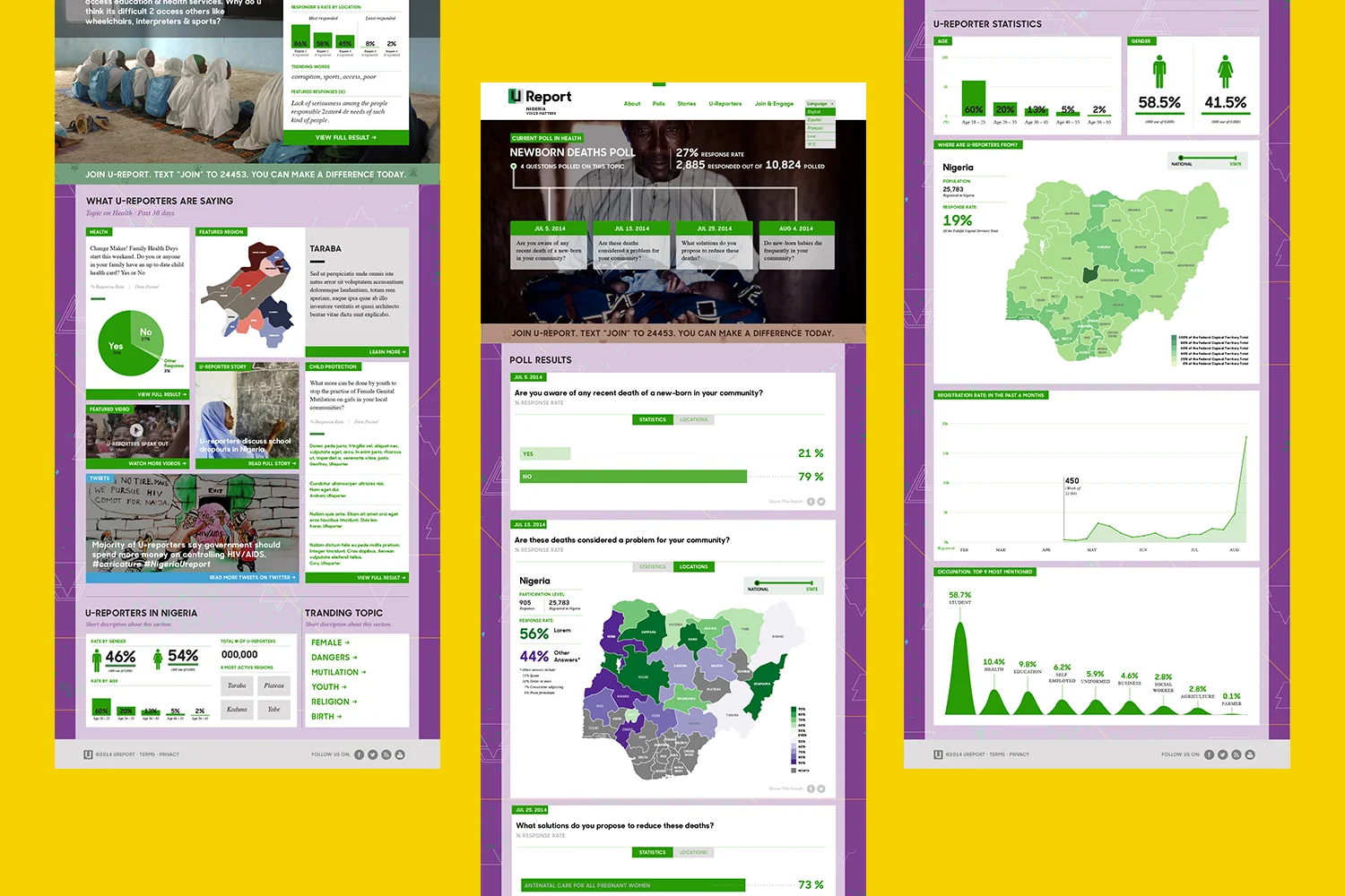
Designed visualization templates across poll formats and aggregation levels
Project Impact
6 → 68 countries, 10M+ U-Reporters by 2020
Launched and presented at the 2014 UN General Assembly
2014 World Summit Award winner, Government & Citizen Engagement
01 · Problem
Mass data without a readable output
27,730 replies came back from a single Uganda poll. Poll data could include percentages and categories, open-ended responses, demographic breakdowns, and results across geographic levels. The existing sites had no consistent way to turn that data into something people could read. A field researcher interviewed the Uganda team and mapped the existing system. Database capacity and the SMS pipeline went to engineering.
My scope was the public web layer: how that data would be organized and presented to the reader.

System audit from interviews with the Uganda team
Zambia listed poll results as counts in a text block. Uganda drew the same kind of result as a district map with no legend. Neither made the finding easy to understand.

Zambia and Uganda Ureport Poll Result Page, before the redesign.
Each country had also built its own site with no shared information architecture, page templates, grid, or components. Any improvement would have to be repeated for every country.
Web Main Users & User Needs
Researchers
Local / National Media
General Public
Visualize the data
Visualize the data
Learn about U-Report
Filter and segment
Find depth for advocacy stories
Engage and share
The difference was how far each audience needed to go into the data. Researchers needed to analyze and segment it, while media and the public needed a result they could understand and use.
That range of information needs shaped how much detail the web experience exposed and informed the visualization testing later in the process.
Youth?
Youth were left out of the web audience.
Field research in Karamoja looked at how often U-Reporters could get online. For many, the website was out of reach. Participation stayed on SMS, while the web focused on making their responses visible to the outside world.
Information architecture
Page templates
Grid
Visualization formats
Fixed in the system
Logo color (Core color)
Background pattern
Language
Imagery
Configured per poll: the admin picks which visualization format each poll uses
U-Report was going to keep adding countries, and design resources were not going to grow with it. The shared structure kept the core experience consistent while giving country teams control over the parts they needed to change.

01 Poll Timeline: Temporal complexity
Polls went out in series, with related questions sent over several weeks. A single result could lose meaning without the questions around it.
The timeline kept related questions together in one view, so readers could understand each result in the context of the larger topic.
02 Visualization templates: Data complexity
Poll results could range from simple percentages to open-ended responses and geographic breakdowns. Early concepts let readers go deeper into the data—comparing related polls, exploring connected keywords, and drilling down through geographic levels.

Exploring levels of depth
Field research in Uganda tested how much complexity people could accurately interpret. The final designs reduced that depth, keeping the result itself easy to read while preserving deeper exploration where it added the most value.
Geographic results kept a simplified national-to-state view, while statistical and keyword results surfaced the finding more directly.

Geographic results preserved drill-down while keeping participation and poll results visible at each level
03 Country visual layer: Configuration complexity
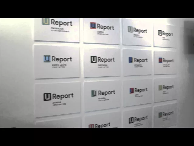
Each country needed room for its own identity as U-Report expanded.
The page structure and visualization formats remained shared, while the logo, color, language, imagery, and background patterns could vary by country.


“An obvious force for social change.”
— World Summit Award, 2014

Next Project